Improvement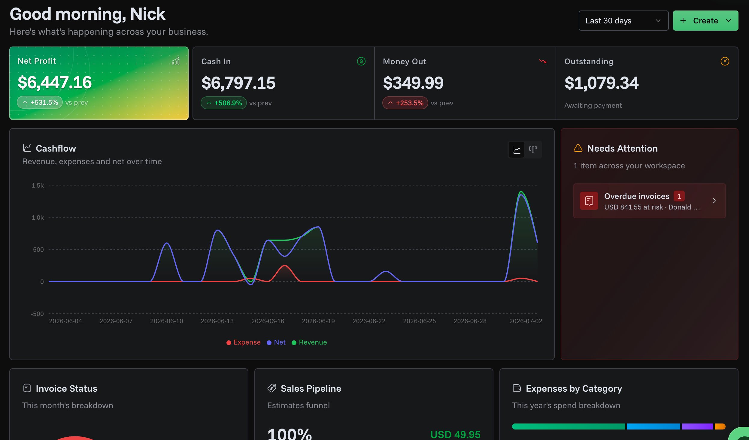
New Dashboard Home
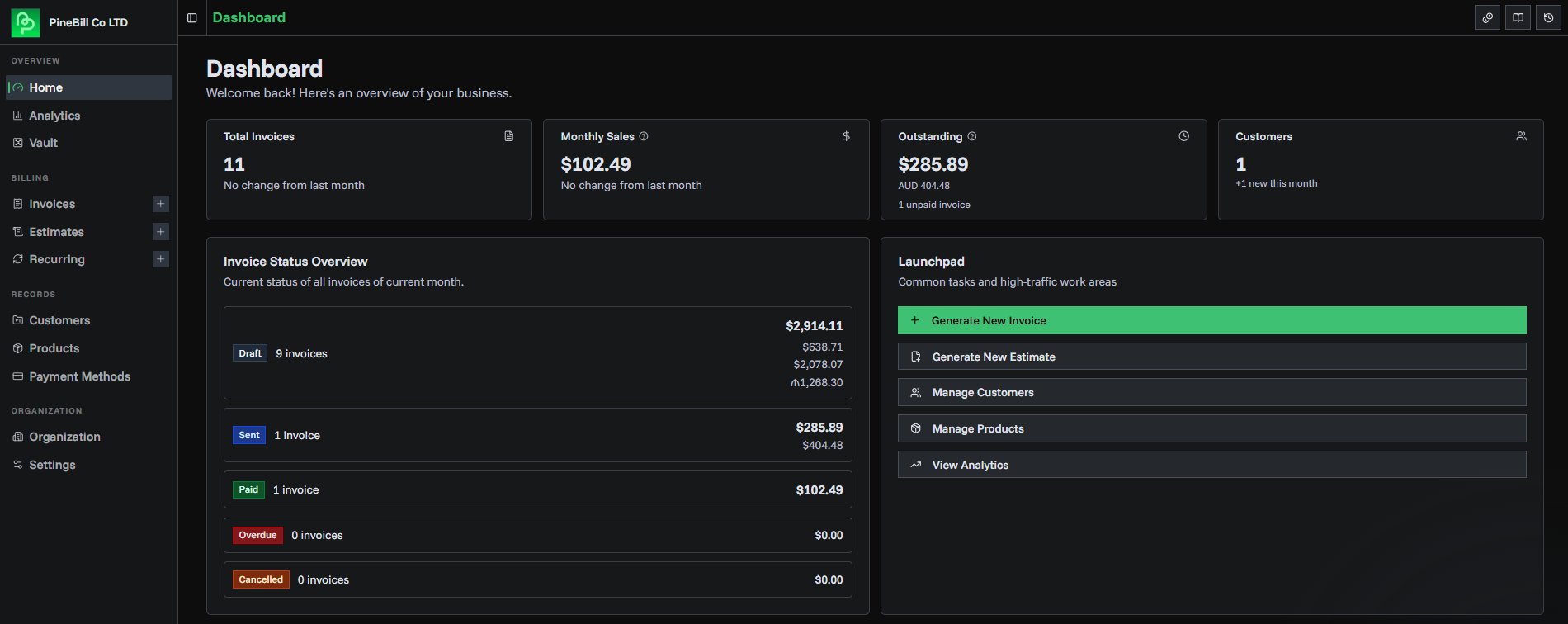
The dashboard home page has been rebuilt to give you a real-time snapshot of your business the moment you log in.
What's new
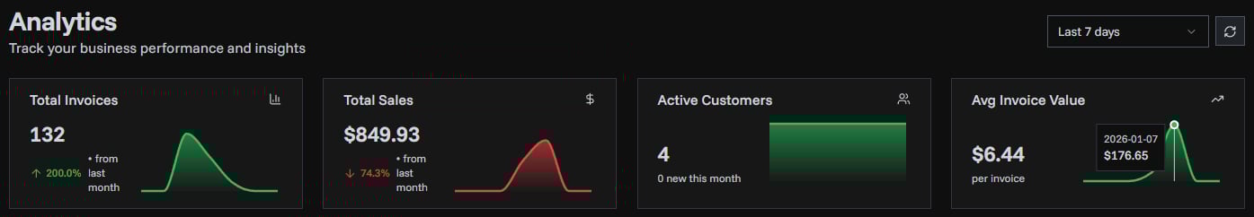
- KPI cards — Revenue, receivables, overdue, and tracked hours with trend sparklines and period-over-period deltas
- Cashflow chart — Income vs. expenses visualized over your selected date range
- Needs attention — Overdue invoices, pending estimates, and upcoming recurring invoices surfaced in one place
- Invoice status donut — Breakdown of invoices by status (paid, pending, overdue, draft)
- Sales pipeline — Estimates moving through stages from draft to accepted
- Expenses by category — See where your money is going at a glance
- Active timers & project progress — Running time trackers and project completion status
- Activity feed — Recent actions across the organization
- Date range filtering — Switch between 7d, 30d, 90d, 12m, or year-to-date presets
1 min read
PT
PineBill Team