Improved Basic Analytics
Enhanced analytics dashboard with better data visualization, top product insights, and improved date formatting
|1 min read|
PT
PineBill Team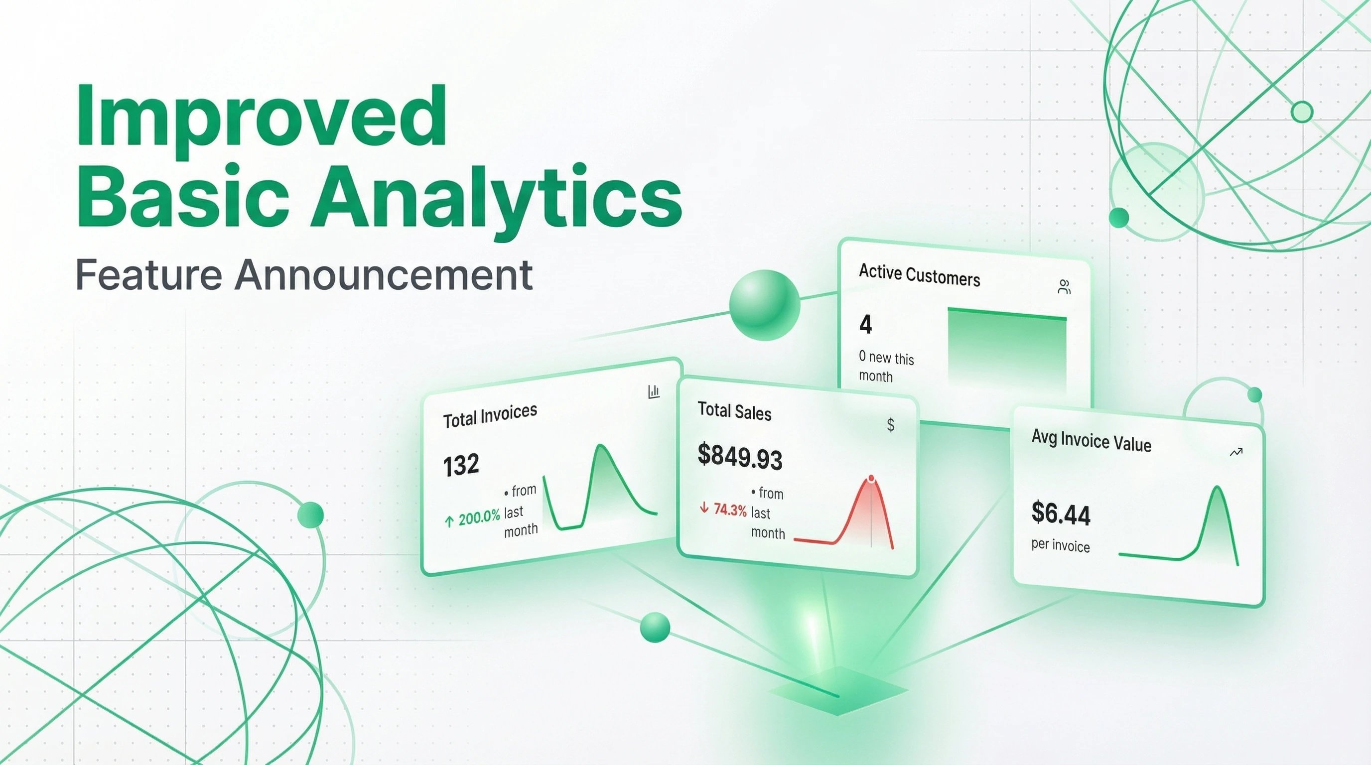
We've improved our Basic Analytics UI/UX to give you clearer insights into your business performance. The updates focus on making your data easier to understand and act upon.
Better Data Visualization
We've enhanced how data is displayed throughout the analytics dashboard:
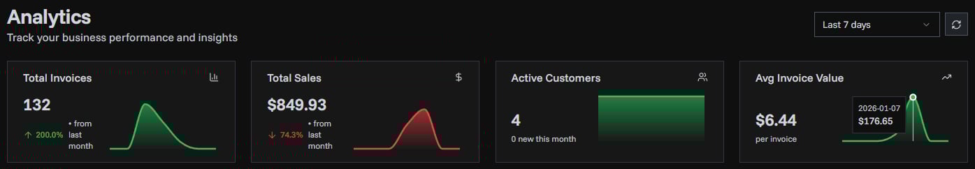
- Clearer tooltips - Hover over charts and metrics to see detailed information with improved formatting
- Better date display - Dates are now shown in a more readable format, making it easier to track your performance over time
- Improved color handling - Charts now use colors that make data easier to distinguish at a glance
We're continuously working to make PineBill's analytics more useful for your business. Stay tuned for more improvements!
analyticsdashboarddata visualization