Analytics
Track revenue, expenses, customer growth, product performance, and employee metrics.
Quick Start
Analytics provides insights into your business performance. Access it from Dashboard → Analytics.
Date Range Selection
All charts and metrics update based on the selected date range:
| Period | Description |
|---|---|
| Last 7 days | Data from the past week |
| Last 30 days | Data from the past month |
| Last 90 days | Data from the past quarter |
| Last 12 months | Data from the past year |
| Year to date | From January 1st to today |
| This year | All data in the current calendar year |
To change date range:
- Click the date range dropdown (top-right)
- Select a period
- All charts update automatically
Refresh button:
- Click the refresh icon to reload all data
- Useful after creating new invoices or customers

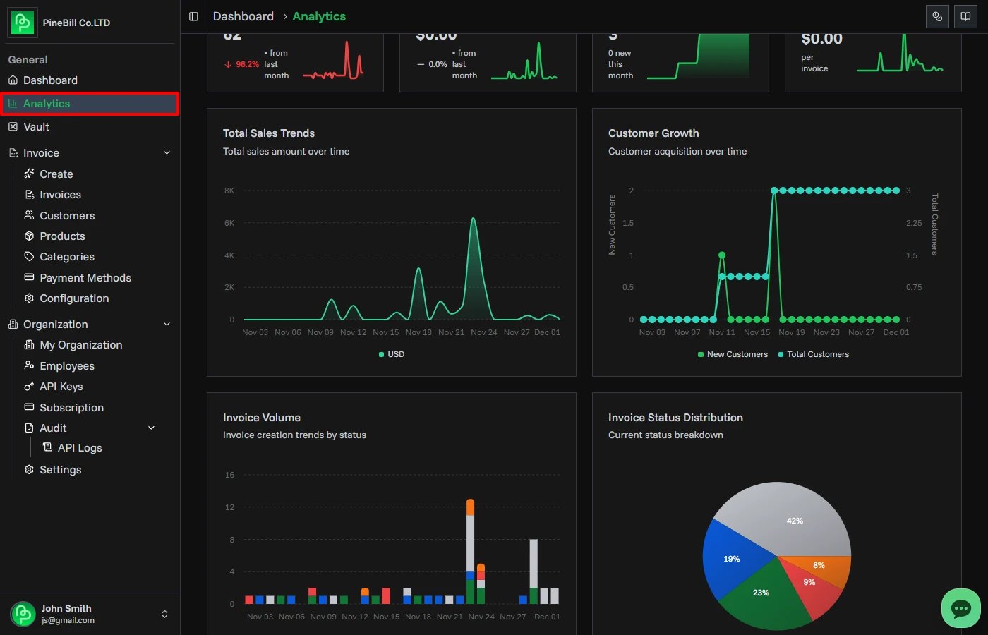
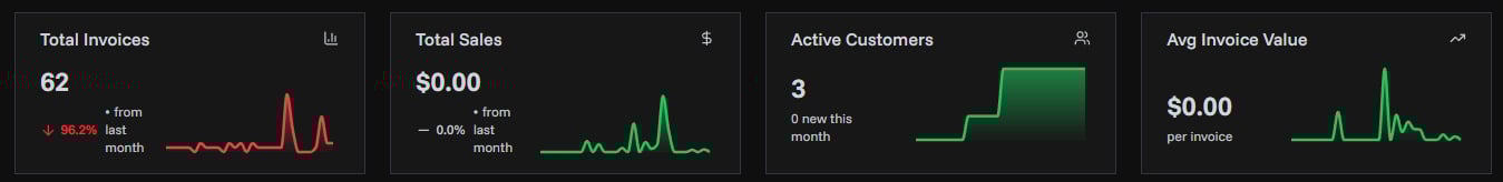
Basic Metrics
Available on all subscription plans. Four metric cards display at the top:
Total Invoices
- Count of all invoices in the selected period
- Trend percentage vs previous period
- Mini sparkline chart showing invoice creation over time
Total Sales
- Revenue from all paid invoices
- Converted to your organization's default currency
- Multi-currency invoices automatically converted using current exchange rates
- Trend percentage vs previous period
- Mini sparkline chart showing revenue over time
Active Customers
- Total number of customers
- Shows new customers added in the selected period
- Mini sparkline chart showing customer growth
Avg Invoice Value
- Average revenue per invoice
- Calculated as: Total Sales ÷ Total Invoices
- Displayed in organization currency
- Mini sparkline chart showing average value trend
Currency Handling:
- All amounts display in your organization's default currency
- Invoices in different currencies (EUR, GBP, etc.) are converted automatically
- Uses current exchange rates from the currency store
Advanced Analytics (Pro+ Plans)
Advanced charts require a Pro or Enterprise subscription.
Total Sales Trends
Line chart showing revenue over time:
- Grouped by day, week, or month depending on date range
- Hover over points to see exact amounts
- All currencies converted to organization currency
- Identifies revenue patterns and trends
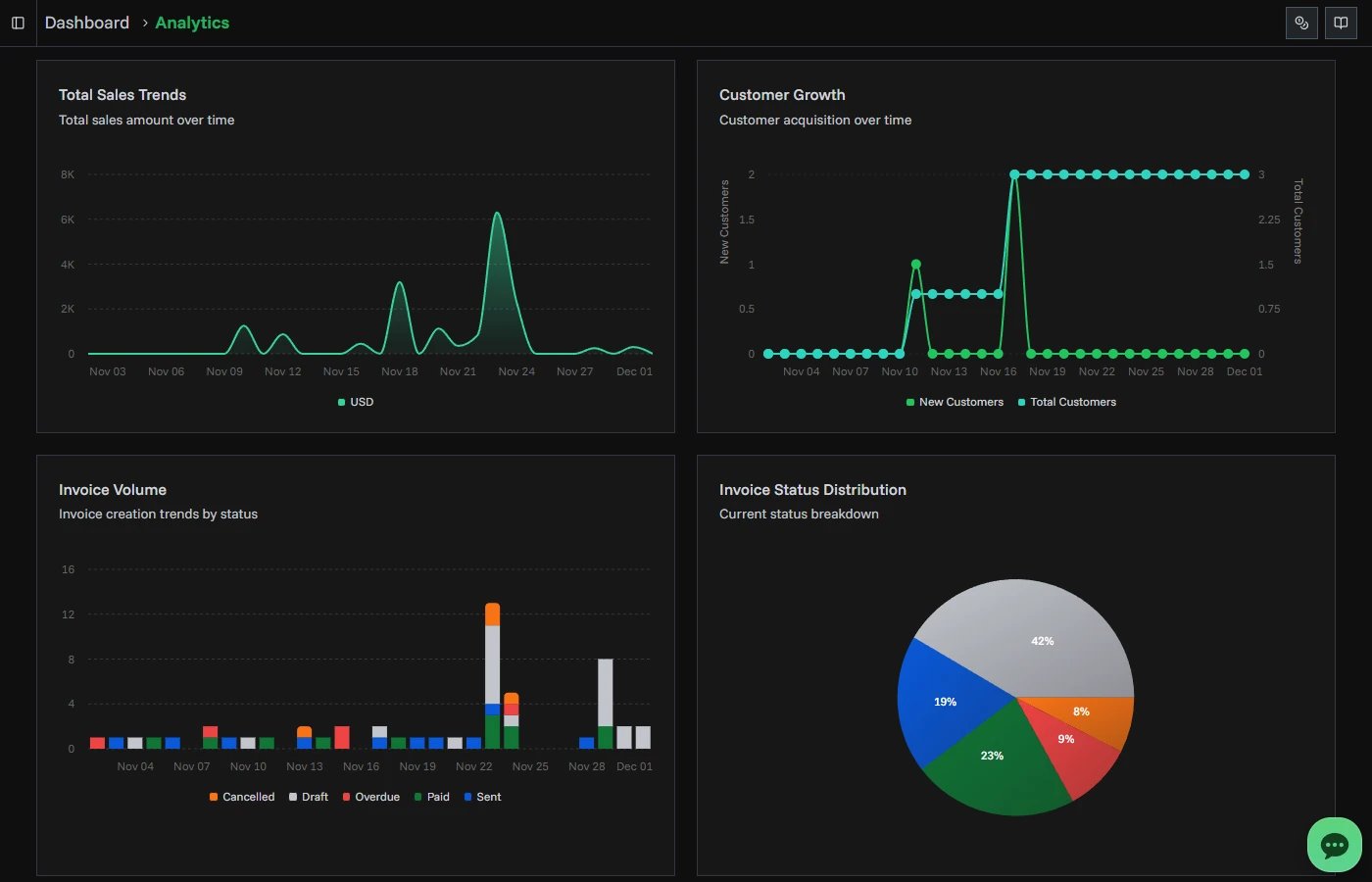
Customer Growth
Line chart showing customer acquisition:
- Total customers over time
- New customers added each period
- Grouped by time period
- Shows growth rate
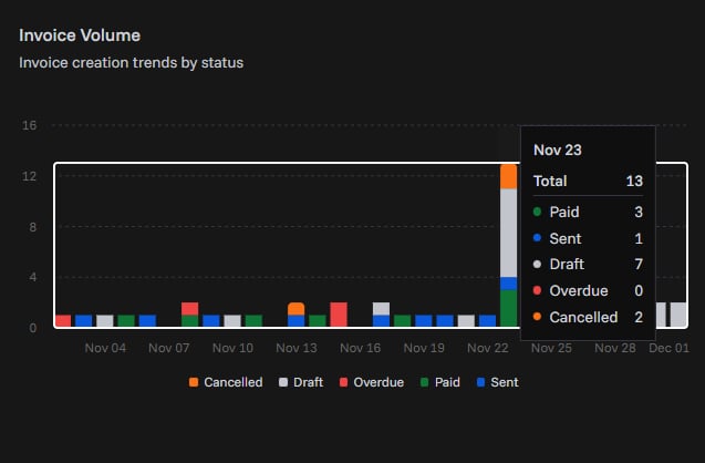
Invoice Volume
Stacked area chart showing invoice creation by status:
- Draft invoices (gray)
- Sent invoices (blue)
- Paid invoices (green)
- Overdue invoices (red)
- Cancelled invoices (orange)
- Hover to see count for each status
Invoice Status Distribution
Pie chart showing current invoice breakdown:
- Percentage by status
- Total count for each status
- Click legend items to show/hide statuses
- Helps identify bottlenecks
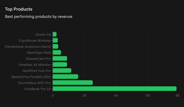
Top Products
Horizontal bar chart showing best-selling products:
- Top 10 products by revenue
- Revenue amounts in organization currency
- Helps identify your most profitable products
Product Trends
Line chart showing sales trends for top products:
- Up to 5 products shown
- Color-coded by product
- Revenue over time
- Hover to see exact amounts
- Identifies seasonal patterns
Expense Analytics
Expense charts show how business spending changes over time.
You can review:
- Total expense amount for each period
- Expense count for each period
- Spending in your organization's default currency
- Trends grouped by day, week, month, quarter, or year

Expense Bar Chart
The grouped expense bar chart is useful for comparing spending across larger periods.
Use it to quickly answer:
- Which month had the highest spending?
- Are expenses increasing or decreasing?
- How many expense records were created in each period?
- Do spending spikes match travel, contractors, software renewals, or other categories?
Enterprise Analytics (Enterprise Plan)
Enterprise-level insights require an Enterprise subscription.
Employee Performance
Leaderboard showing top employees by revenue:
- Employee name and performance metrics
- Total revenue generated
- Invoice count
- Conversion rate (paid invoices ÷ total invoices)
- Sorted by total revenue
- All amounts in organization currency
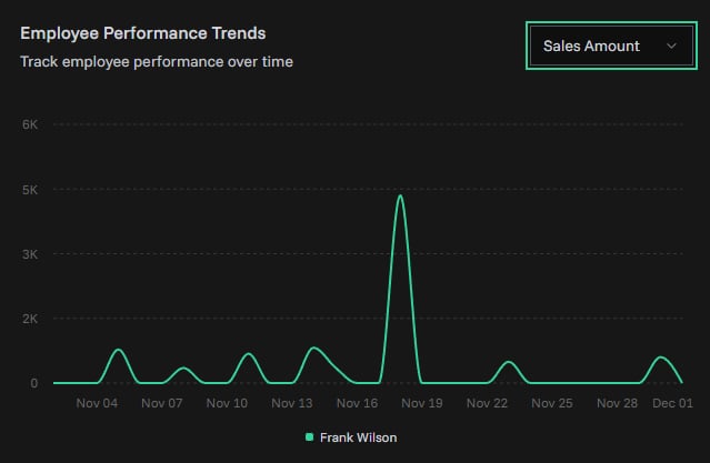
Employee Performance Trends
Line chart showing employee performance over time:
- Tracks up to 5 top employees
- Color-coded by employee
- Switchable metrics using dropdown:
- Sales Amount: Revenue generated
- Invoice Count: Number of invoices created
- Conversion Rate: Percentage of paid invoices
To change metric:
- Click the metric dropdown (top-right of chart)
- Select Sales Amount, Invoice Count, or Conversion Rate
- Chart updates immediately
Customer Lifetime Value (LTV)
Three metric cards showing customer value:
Total Customers:
- Count of all customers tracked
Avg Customer LTV:
- Average lifetime value per customer
- Calculated as: Total revenue from all customers ÷ Total customers
- Estimated value in organization currency
Total LTV:
- Cumulative lifetime value across all customers
- Sum of all customer revenue
- Organization currency
Understanding the Data
Multi-Currency Support
Analytics automatically handles multiple currencies:
- All invoices converted to organization default currency
- All expenses converted to organization default currency
- Uses current exchange rates from currency store
- Ensures accurate totals across different currencies
- Example: USD invoices + EUR invoices = total in USD (or your default currency)
Date Grouping
Charts automatically group data based on date range:
- 7-30 days: Grouped by day
- 90 days: Grouped by week
- 12 months+: Grouped by month
Empty States
If no data exists for the selected period:
- Charts show "No data available" message
- Metric cards show zero values
- Create invoices, customers, products, or expenses to start seeing analytics
Subscription Limits
Basic Plan:
- 4 metric cards only
- No charts
Pro Plan:
- All basic metrics
- Advanced revenue, invoice, customer, product, and expense charts
- Product analytics
Enterprise Plan:
- All Pro features
- Employee performance tracking
- Customer lifetime value
- Employee trend analysis
Performance Notes
- Charts load dynamically to improve page speed
- Large date ranges (12 months+) may take longer to load
- Refresh button reloads all data
- Data updates in real-time as you create invoices
Related Topics
- Creating Invoices - Generate data for analytics
- Expenses - Track costs for expense analytics
- Subscription Plans - Upgrade for advanced analytics
- Dashboard - Quick overview metrics